Project Overview
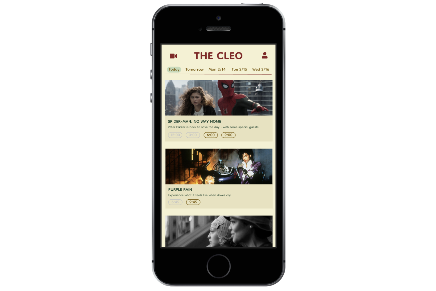
The Cleo is a fictional movie theater based off of The Roxie in San Francisco or Metrograph in New York. Its mission is to connect people through the moviegoing experience, showcase a broad and inspiring range of films, and host community events such as special screenings, film clubs, and director Q&A’s. Independent movie theaters like The Cleo lose revenue when moviegoers purchase tickets through third party vendors. This app is designed to get rid of the middle man and increase profits for The Cleo, while also creating a thriving online community for the theater.
For this project, I conducted interviews and usability studies, did paper and digital wireframing, created low and high-fidelity prototypes, and went through several design iterations.
Research
By conducting in-person interviews I learned that there are three main user groups when it comes to moviegoers: the occasional moviegover, the frequent moviegoer, and the movie buff. The target demographic for this app is the frequent moviegoer.
User Interviews: I was surprised to learn that many moviegoers use third party apps to purchase tickets instead of buying in person or online through theaters. While users varied in the third party apps they used, their goals remained the same: to quickly purchase tickets, avoid fees, and have easy access to said tickets.
Pain Points:
Time: Visiting multiple sites while searching for tickets can be time-consuming.
Overwhelm: Lists of showtimes can be overwhelming, especially when they aren’t filterable
Price: Movies are becoming more expensive and booking online may occur additional fees
Personas
Mike is an outgoing cinephile who needs a one-stop-shop app where he can browse showtimes, book tickets, and earn rewards because he goes to the movies every week.
User Journey Maps
Mapping Amy’s user journey highlighted the importance of making the app simple and easy to use for our less tech-savvy users.
Initial Designs
Sketches
Low-Fidelity Prototype
Wireframe - Profile Page
Wireframe - Home Page
User Testing
I conducted two usability studies. The first round was with digital wireframes and the second round was with a high-fidelity prototype. After each round I made adjustments to the designs based on the study findings.
Main Findings:
Filters: Users want to set filters before selecting showtimes
Tickets: Users want the simplest possible ticketing experience
Profile: Users want to see all their information in one place
Design Updates
Before Usability Study: Initially I had a date and time filter at the top of the screen.
Before Usability Study: To access their tickets, users had to go to their profile.
After Usability Study: I noticed users were clicking on the showtimes instead of using the time filter during the usability study so I removed it, simplifying the design.
After Usability Study: During the second usability study, one user suggested it would be nice if the ticket was easier to access so I added a ticket icon to the homepage.
Final Designs
Conclusion
The Cleo app allows users to purchase tickets with ease and support their local theater at the same time! According to one subject in the second usability study: “This is super easy-to-use. I wouldn’t change a thing!”
Next Steps:
Build out the rewards program
Allow user interaction
Make a website


